UnitedHealthcare (UHC)
Driving Retention Through Design: Redesigning the PFNY Experience
Team
Isaac (me) – Project Lead
Kathy – UX researcher
Erin – Studio Manager
Alejandro – UX designer
Tesia – UX Content Writer
My role
- Lead Designer
- Design Strategist
- UX researcher
Objective
Transform the end-of-year plan review process to boost retention and provide a seamless, intuitive member experience.
Timeline
January 2024 – October 2024
Project Overview
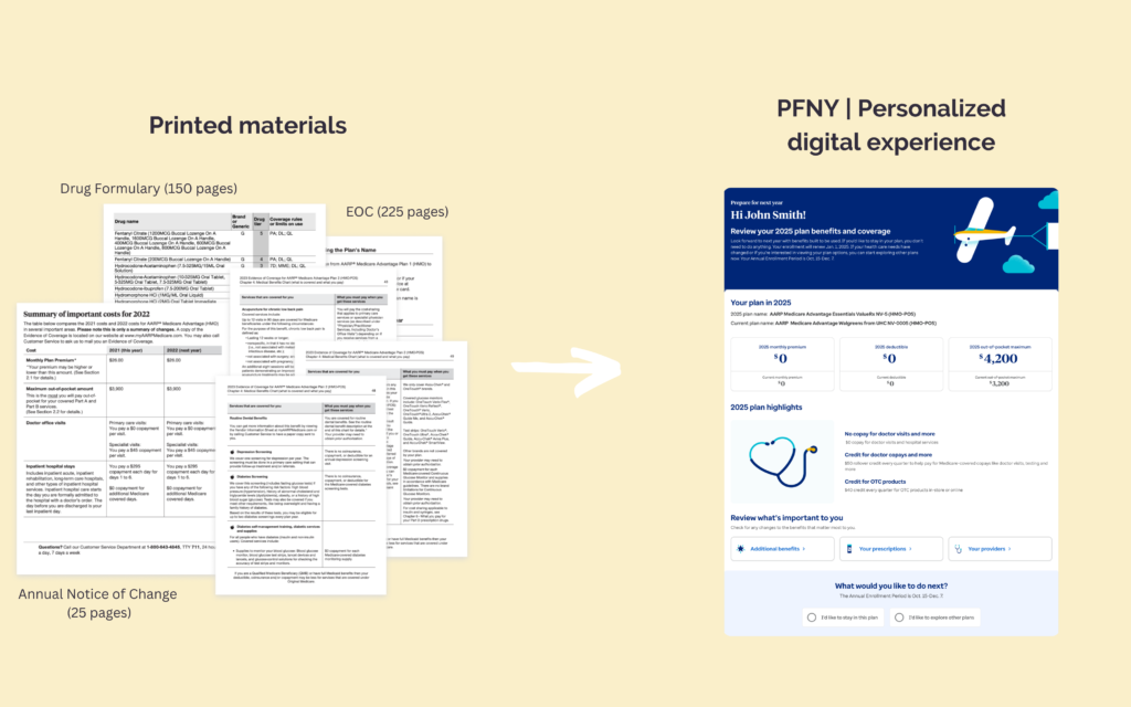
As the Lead UX Designer and Strategist for UnitedHealthcare, the largest health insurance company in the USA, I spearheaded the Prepare for Next Year (PFNY) initiative. The digital experience helps Medicare members review their current health plan and understand how it will change for the upcoming year by providing a clear, year-over-year comparison of coverage, highlighting updates to benefits, costs, or services.
The PFNY experience goes live during the Annual Enrollment Period (AEP), from October to December, a critical time when members can review their plan changes and decide whether to stay with their current plan or switch to a new one. With its limited availability, the PFNY initiative is vital for ensuring members have the tools and information needed to make confident, informed healthcare decisions.
I leveraged design thinking, user research, and the Jobs To Be Done (JTBD) framework to understand member needs, which informed actionable recommendations for product partners. This guided the development of a modular, scalable design that highlights key benefits while ensuring easy access to detailed information, effectively addressing both member needs and business goals.
The redesigned PFNY experience delivered measurable results:
- 289,000 additional Medicare Advantage (MA) enrollments, exceeding projections, and significantly improved D-SNP retention, reducing full dual terms from 40,000 to 15,000 year-over-year.
- 911 members enrolled directly through PFNY, with over 400 D-SNP mobile enrollments, generating an estimated $2.7 million in retained revenue.
- A 6% reduction in call volume during AEP, demonstrating improved self-service capabilities and member satisfaction.
These outcomes showcase the value of a member-focused approach in driving loyalty, enhancing satisfaction, and achieving business success.
Challenge & Goal
Before 2023, Medicare members typically reviewed their plan changes at the end of the year, looking for positive updates such as increased funding for medications or new fitness programs. However, in 2024, many services were set to be reduced or discontinued due to government budget cuts.
Given these changes, our challenge is to ensure that members have everything they need at this critical decision-making moment to feel confident in their UHC plan for the following year.
How might we...
…showcase plan value?
…simplify the experience and increase confidence in the information?
…offer a suggested plan when a member is eligible?
…highlight positive aspects of a plan and add context to help members understand the changes?
…translate the web portal experience into native mobile app
An additional constraint is that the PFNY initiative is only live for a very short window, which meant we had to strictly adhere to our timeline and could not depend on quick fixes or iterations once it launched.
Discovery
Conducting thorough discovery work was essential for this project as it provided critical insights into member needs and expectations, enabling us to create a more effective and user-centered PFNY experience that significantly enhanced member retention and satisfaction.
Evaluating current state
UHC collects extensive voice of customer data, and I invested time in evaluating past feedback through Qualtrics, analyzing comments for patterns, reviewing analytics, and watching screen recordings of members navigating the previous year’s PFNY experience to identify key opportunities for improvement.
VOC (Qualtrics)
- Analyzed 439 comments across various plan types to understand member feedback.
- Conducted affinity mapping to identify 32 key themes related to member experiences and concerns.
Real-Time Monitoring
- Reviewed 25 live recordings of members navigating the PFNY experience.
- Documented 13 distinct member experiences to uncover pain points and opportunities for improvement.
Adobe Analytics
- Collaborated with the analytics team to create a custom PFNY dashboard, incorporating member segmentation based on behavior and important dates.
- Used data insights to identify pain points, particularly regarding the unavailability of data at critical times.
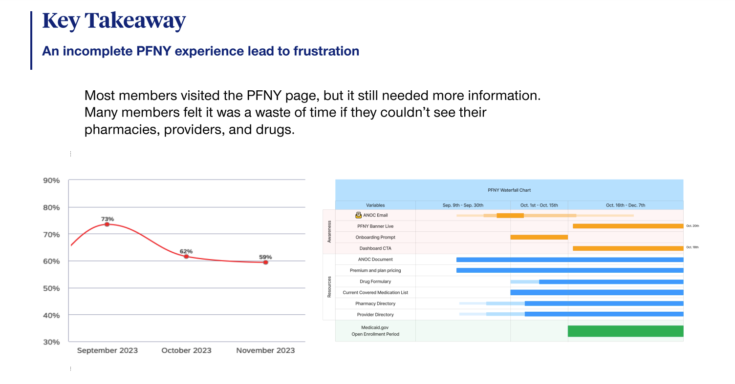
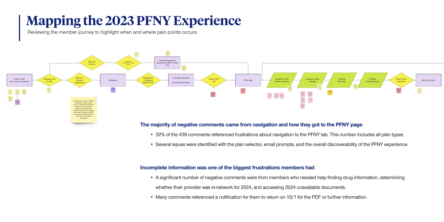
The research revealed crucial insights that drove the creation of new product features and aligned marketing and design efforts with a revised roadmap. This approach ensured a holistic design strategy for the 2024 design work.
Jobs To Be Done | Understanding the member
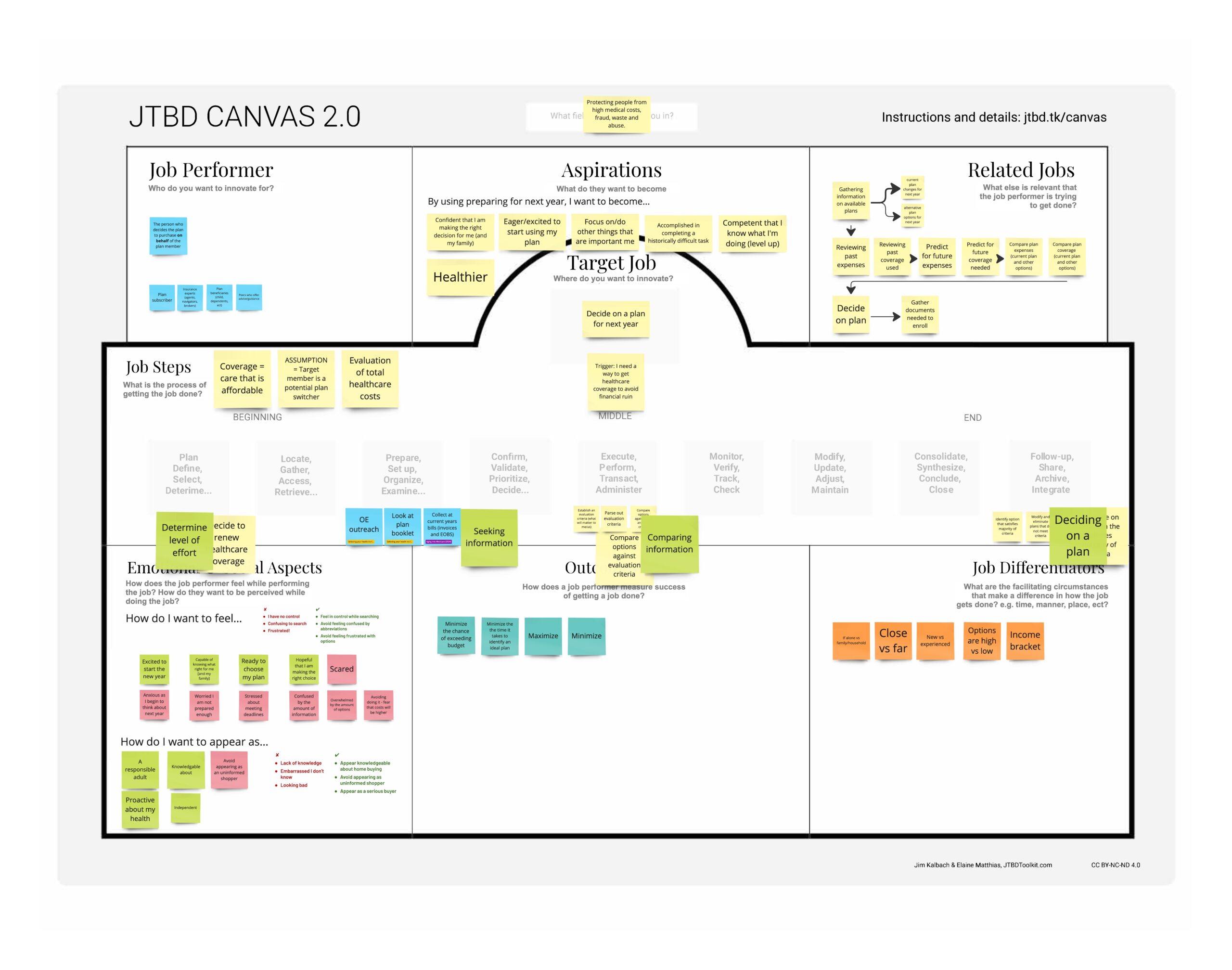
I worked with the UHC research team to implement JTBD research to better understand Medicare members’ (M&R) needs and motivations during the plan review process. This research helped identify key tasks and pain points, allowing us to create a more user-centered experience that enhances member engagement and retention.
- Reviewed 38 secondary research reports.
- Evaluated 2,320 member comments using AI and affinity mapping.
- Surveyed 772 participants.
- Discovered 42 jobs related to preparing and planning next year’s coverage.
Outcome of research
Using the Jobs To Be Done (JTBD) framework and evaluating the 2023 PFNY experience helped us identify key pain points faced by members during the plan review process. This analysis revealed specific challenges and opportunities for enhancing the user experience, guiding the development of more effective design solutions for 2024.
Once we moved into the design phase, I led the process by creating user flows to ensure alignment with stakeholders. Given the project’s high stakes, I collaborated closely with the VP of marketing, product owners, and a total of 18 stakeholders across the organization to solidify our strategy before diving into the UI designs.
I developed two distinct design approaches and conducted user testing to gather data-driven insights, helping us identify the most effective solution and ultimately influencing our diverse group of stakeholders.
Designing Concepts
Once we entered the design phase, I led the process by creating user flows and developing wireframes to clearly communicate the design’s fidelity and prevent them from being included in marketing demos or sent to “C” level prematurely for review, which had been a challenge in the past.
This approach allowed us to quickly design and align with stakeholders throughout the process. Given the project’s high stakes, I collaborated closely with the VP of marketing, product owners, and a total of 18 stakeholders across the organization to solidify our strategy before advancing to higher-fidelity UI designs.


While aligning on strategy with partners, I developed two distinct design approaches and lead a comparative study to gather data-driven insights, helping us identify the most effective solution and ultimately influencing our diverse group of stakeholders.
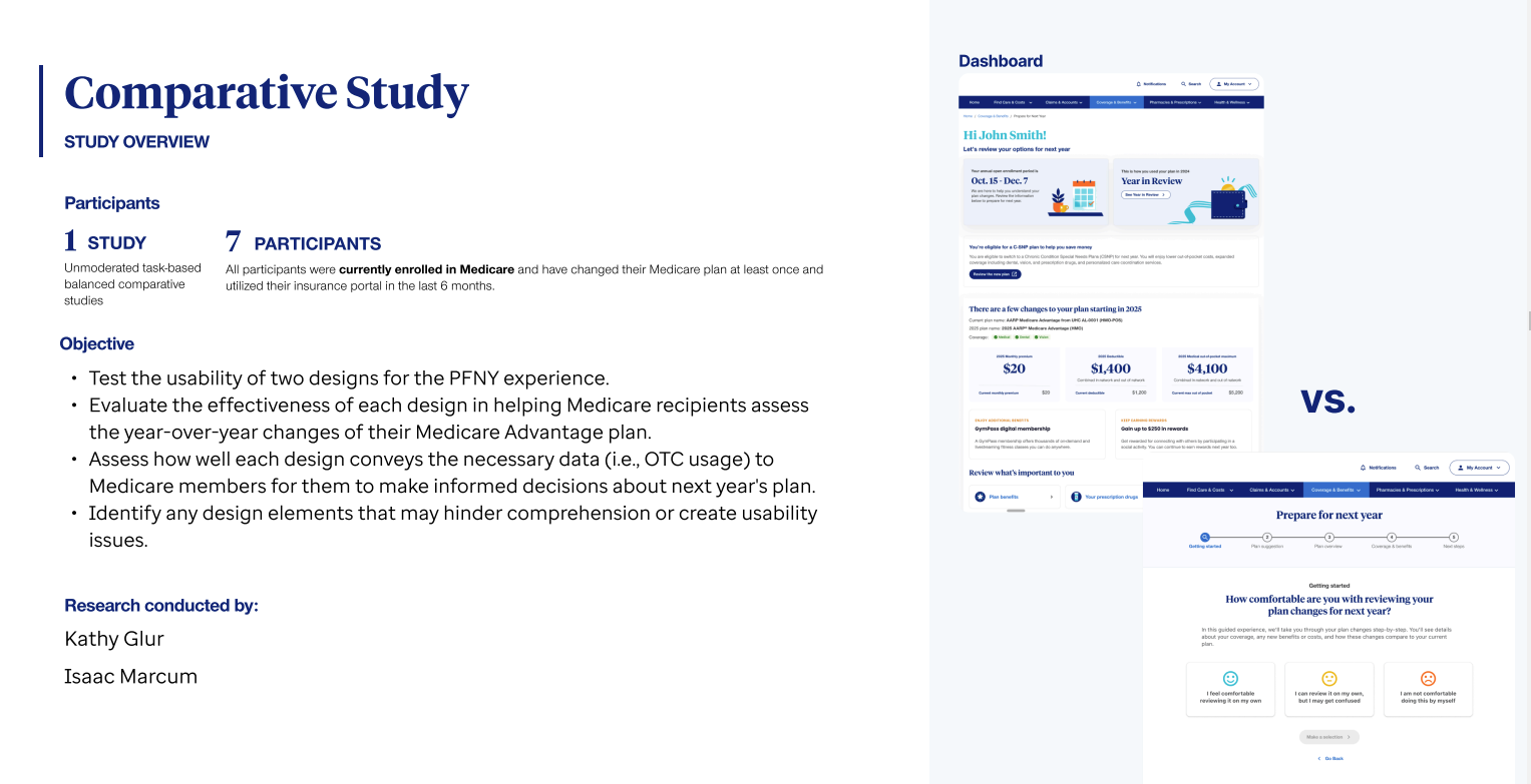
The research enabled us to identify the strengths and weaknesses of both approaches. Ultimately, we chose a strategy that increased members’ confidence in their decisions and resulted in higher satisfaction ratings.
Making The Designs Scalable
Once we established a general approach, I focused on the nuances of the design. While the PFNY experience primarily targeted the Medicare population, it also needed to accommodate other populations and insurance types. Therefore, it was essential to ensure that the design would be scalable to other Lines of Business (LOBs) to minimize technical debt when we went into production.
I collaborated with developers to verify that the design functioned as intended across multiple data sources for various insurance types. This collaboration led to the creation of modular design elements that could adapt based on member type. Additionally, I worked with a designer on my team to develop design components and create comprehensive documentation.

Finalizing the designs with member feedback
With a refined modular design approach, we conducted another round of usability testing to ensure the quality of our work, including iterative testing that enabled us to make necessary adjustments and finalize the design.
Simultaneously, we collaborated closely with our UX content strategy partners to ensure the PFNY experience met marketing and legal requirements. Fortunately, our team planned ahead, allowing us to build in sufficient lead time to effectively address these considerations and implement the final copy into our prototypes for testing.
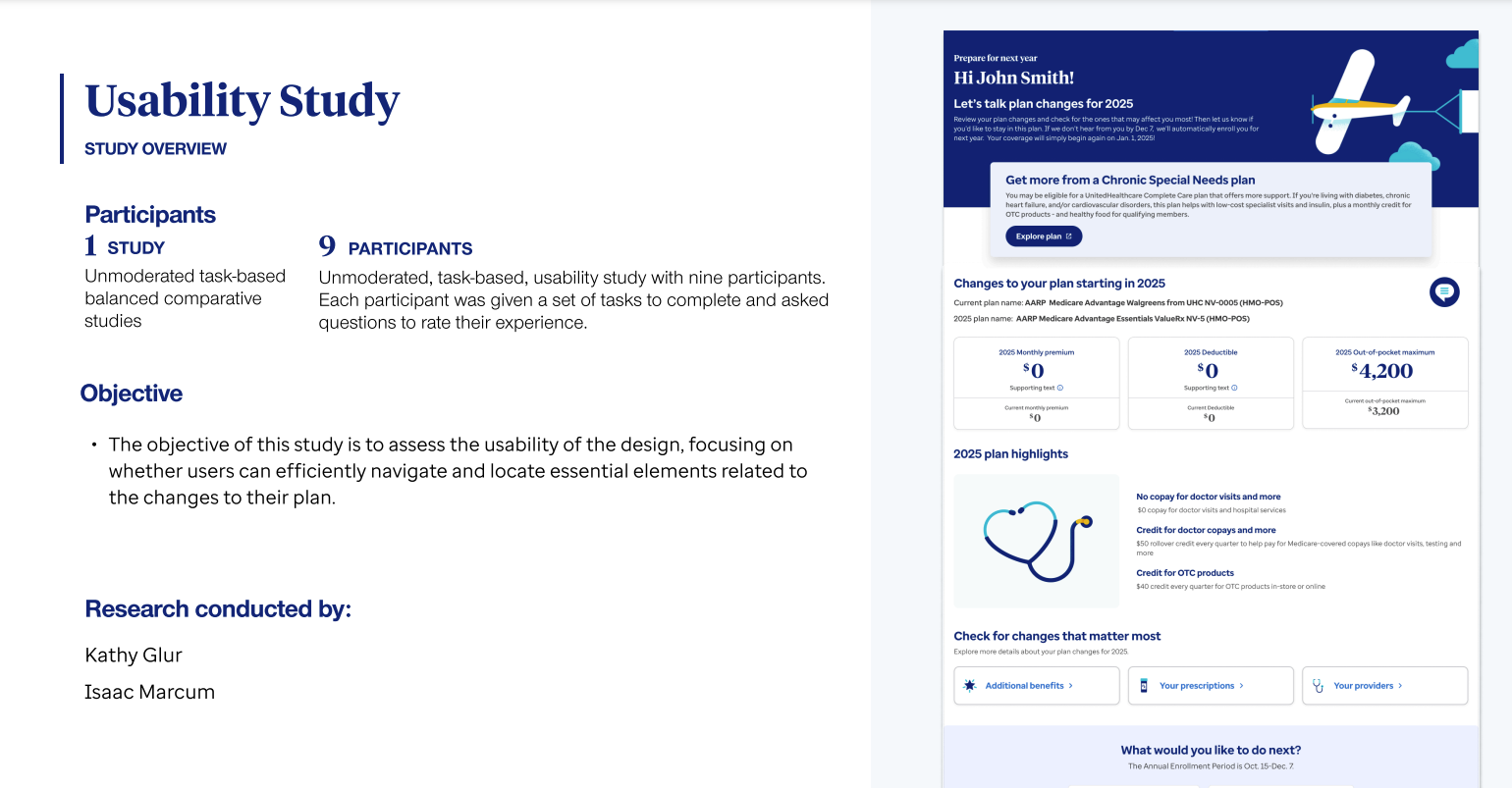
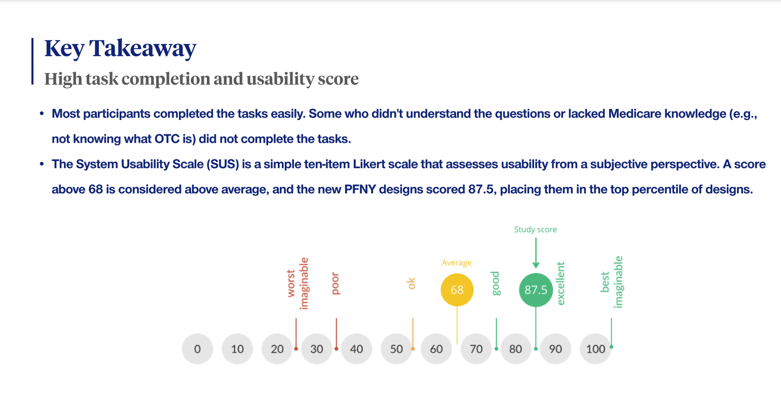
Outcome of Usability Research:
- The study validated many design assumptions and helped ensure high-quality designs for development.
- Content improvements were implemented based on findings that revealed areas where members had low understanding or hesitation.
- Issues with engaging the chat feature were identified as part of a larger strategy for chat initiatives beyond the PFNY space; this feedback was communicated to the appropriate team for future improvements and collaboration in the 2025 PFNY.Outcome
The Deliverables
I collaborated with the designer on my team to create detailed handoff files from our designs, which included specifications, documentation related to our design system, and any accessibility (A11y) documentation. We successfully handed off the designs for both the web and, later, the mobile app.
PFNY Landing Page Design
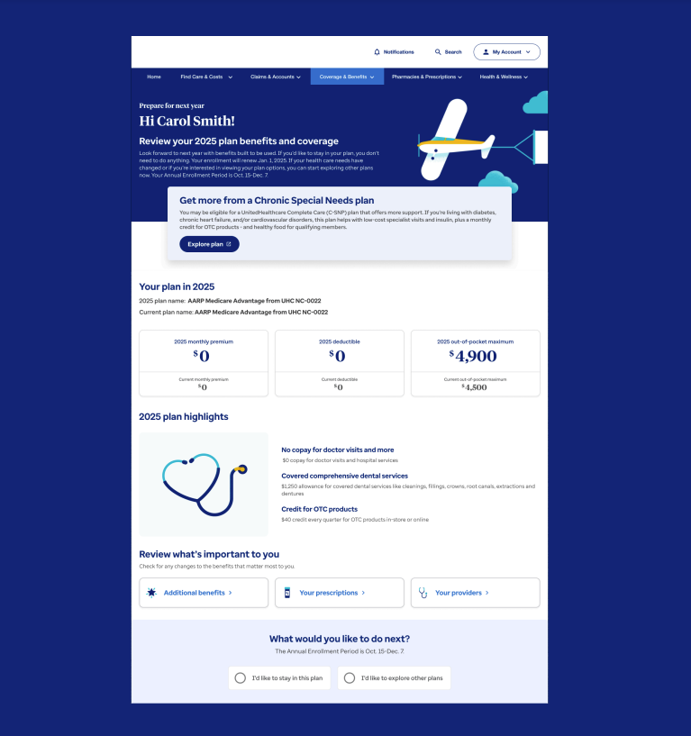
The dashboard design enables members to quickly view an overview of their plan changes while providing easy access to the details that matter most to them. This approach helps prevent overwhelming members with negative news on the first page, allowing them to focus on the positive aspects of their coverage. By highlighting key benefits, the landing page fosters a more engaging experience, supporting informed decision-making and increasing members’ confidence in their plan choices.
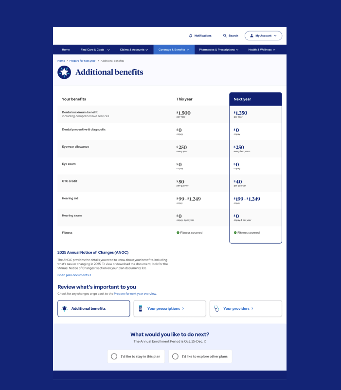
Additional Benefits Detail Page
The Additional Benefits page provides members with detailed context for their year-over-year changes. By utilizing JTBD research and collaborating with stakeholders, we identified important benefits and highlighted positive updates tailored to specific plan types. This flexible design enables us to implement personalized variations that cater to the diverse needs of different member populations.
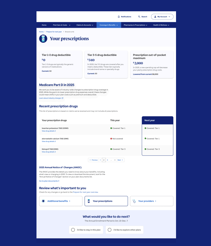
Prescriptions Detail Page
The Your Prescription page provides members with insights into their pharmacy and prescription changes. We recognized the need to include educational materials explaining how the Medicare structure for prescriptions will change industry-wide in 2025, helping to instill trust and confidence in our members.
This page is also personalized, showcasing the most recent prescriptions and any changes in coverage. Our discovery research emphasized the critical importance of drug coverage to our members, making this page a vital resource for their healthcare decisions.
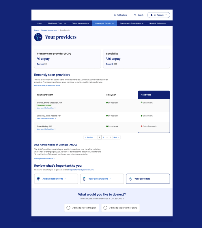
Providers Detail Page
The Your Provider page provides members with insights into their primary care physicians, providers, and specialists. We restructured this information from previous designs to emphasize that provider costs remain unchanged—addressing a significant concern for Medicare and Retirement (M&R) members. This clear presentation helps alleviate member worries and improves their overall experience.
Design Variations For Different Plan Types
The delivery files included six variations of the design, tailored to accommodate different plan types, each with unique considerations. Some plans featured a single landing page, while others varied in the type and depth of information provided.
This flexible design approach ensured we could effectively address diverse member needs. These final design variations were primarily developed to communicate with stakeholders and support agent education post-launch.

Mobile App Designs
We adapted the PFNY designs to a mobile experience by leveraging progressive disclosure to present information in manageable layers, ensuring members could easily access key details without feeling overwhelmed. Adjustments were made to align with updates in our mobile design system, optimizing components for smaller screens while maintaining consistency with the overall design.
Additionally, we accounted for differences in member behavior on the app, such as shorter interaction times and a preference for quick, actionable insights. This informed design choices that prioritized simplicity and usability, creating a seamless and intuitive mobile experience tailored to member needs.

Results
The PFNY initiative delivered a modular, adaptable design that not only addressed immediate member needs but also established a foundation for continuous improvement in 2025 and beyond. By creating a scalable framework, the design accommodates variations for different plan types and member populations, minimizing technical debt and streamlining future updates.
The adapted PFNY designs for the mobile app were a groundbreaking addition, allowing members to view year-over-year changes on their phones for the first time. This innovation increased member engagement by making critical information more accessible and convenient, ultimately contributing to higher retention rates and improved member satisfaction.
Key outcomes include:
- 289k additional Medicare Advantage (MA) enrollees, surpassing projections.
- A 62.5% improvement in D-SNP retention, reducing exiting members from 40,000 in 2023 to 15,000 in 2024.
- 911 direct enrollments from PFNY and over 400 mobile D-SNP enrollments, resulting in an estimated $2.7 million in retained revenue.
- A 6% decrease in call volume during AEP, demonstrating improved self-service capabilities.
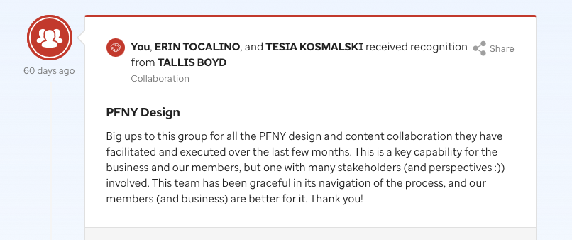
Comment from Sr. Director of Digital Product
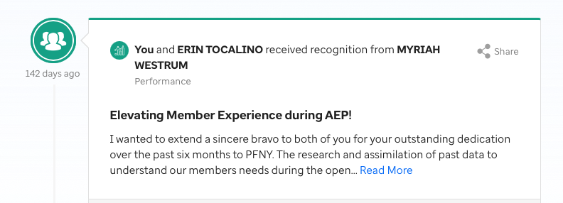
Comment from Sr. Director of UX/CX Design
What I Would do Differently
Despite the emphasis on collaboration, aligning with stakeholders was challenging due to the lack of a clear hierarchy or defined decision-making process. This sometimes slowed down progress, requiring me to rely heavily on research to influence a wide group of people. In the future, establishing clearer roles and decision-making structures would help streamline the process and accelerate the work.
The QA process was less than ideal. To address developer capacity issues, I implemented a handoff system where I provided components used in the designs as they were finalized, followed by the complete experience in a final design file. While this approach helped us meet our deadline, it inadvertently led to developers only reviewing the modular components during QA, rather than the full design. As a result, some significant UI problems arose when the project went to production. Fortunately, I was able to catch these issues, but being more involved in developing the handoff strategy with developers could greatly improve the process for next year.
Let’s work together. Drop me a line!
Once we moved into the design phase, I led the process by creating user flows to ensure alignment with stakeholders. Given the project’s high stakes, I collaborated closely with the VP of marketing, product owners, and a total of 18 stakeholders across the organization to solidify our strategy before diving into the UI designs.
I developed two distinct design approaches and conducted user testing to gather data-driven insights, helping us identify the most effective solution and ultimately influencing our diverse group of stakeholders.